I was drawn to the baby clothing website by its organic fabric, charming prints, frequent promotions, and competitive pricing.
However, the browsing experience fell short. The cluttered homepage and confusing navigation left me feeling overwhelmed; the ineffective filter system turned exploring the extensive product range into a lengthy and frustrating process.
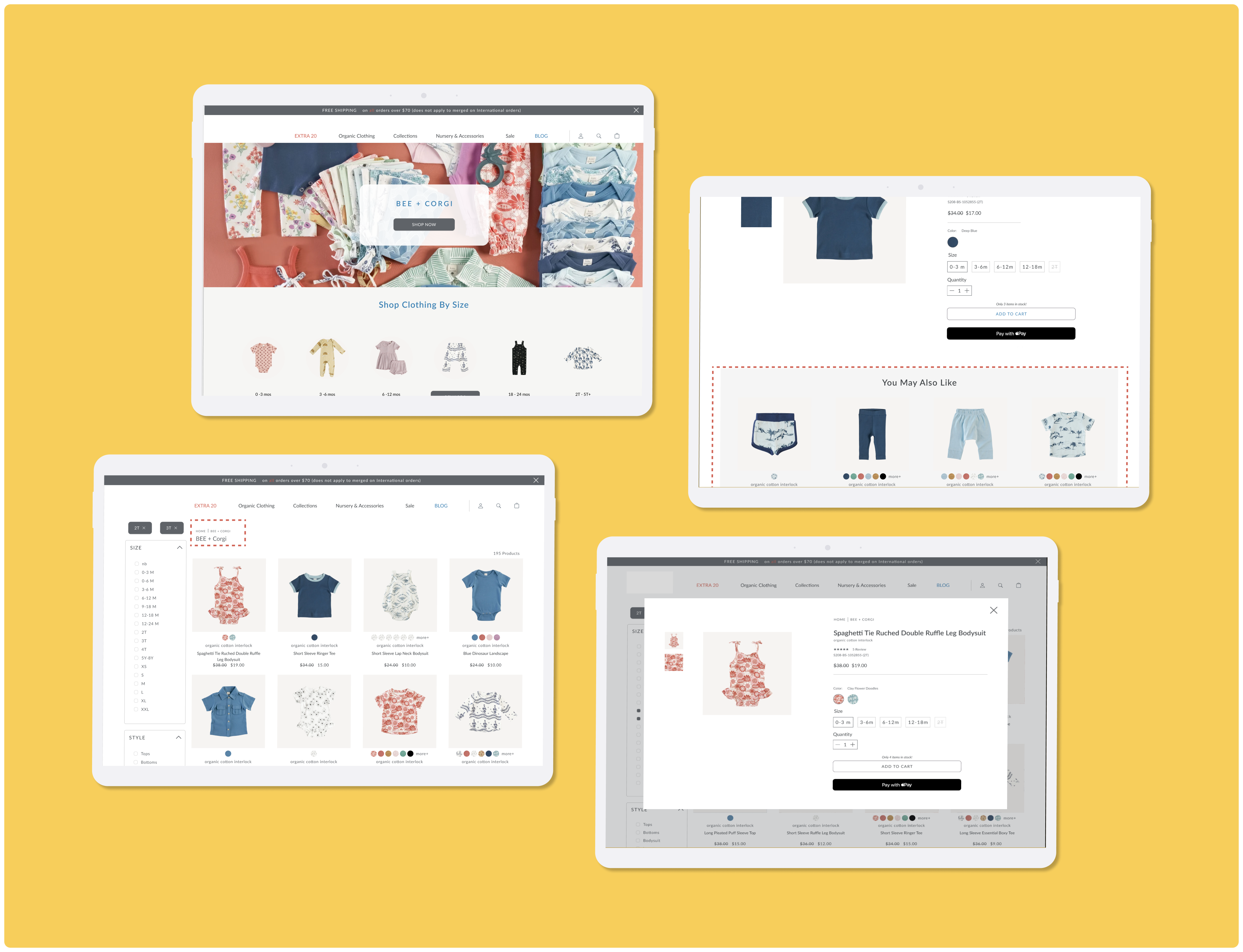
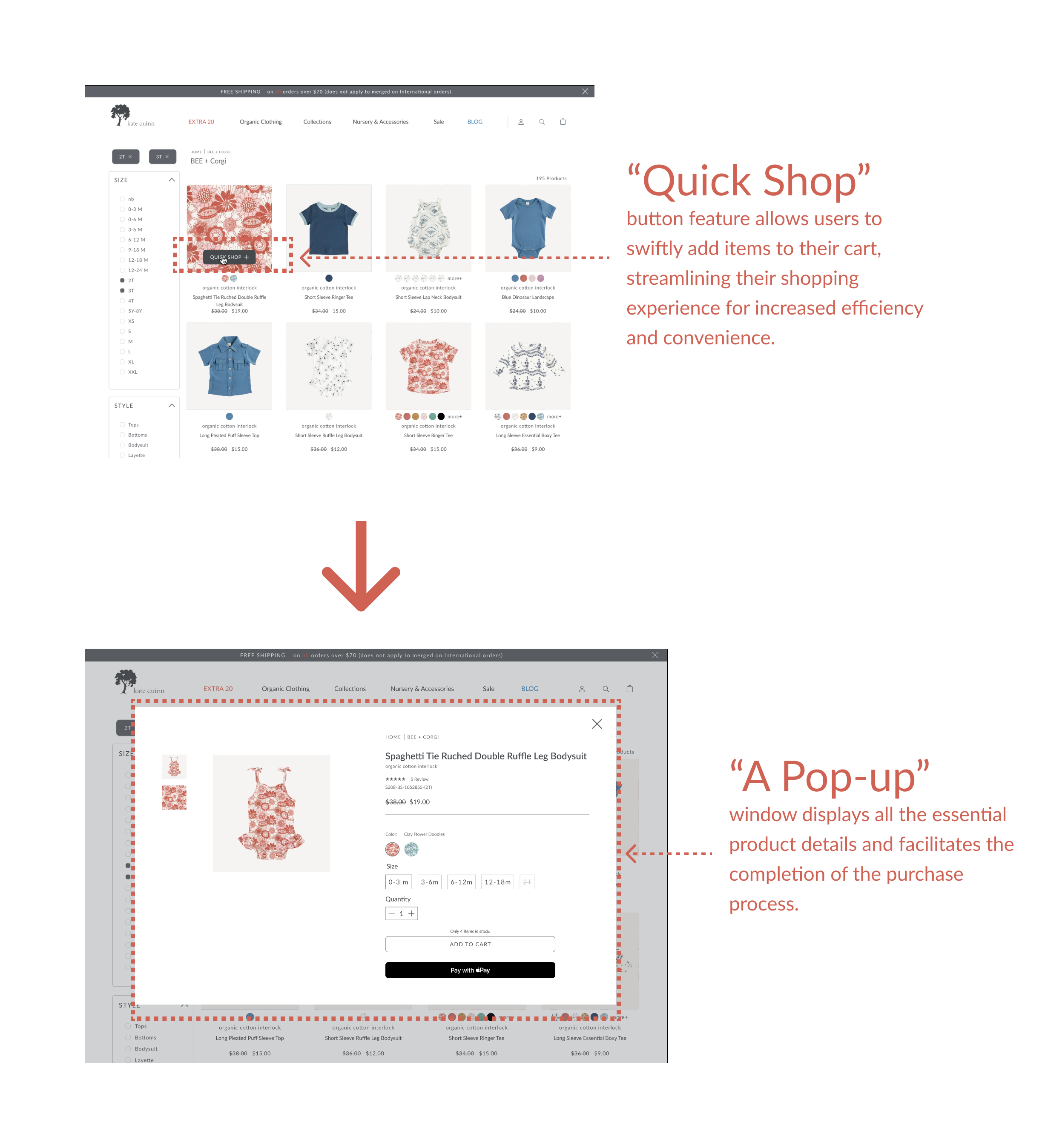
This led me to envision a more user-friendly redesign of this promising brand's website, focusing on improving item discoverability and smoothing out the add-to-cart journey to boost sales.
#Figma
The website's cluttered navigation and filter system hinder an effective shopping journey, leading to customer confusion and frustration. This inefficiency risks customers overlooking desirable items or abandoning their carts entirely due to the challenging experience.
The redesign aims to
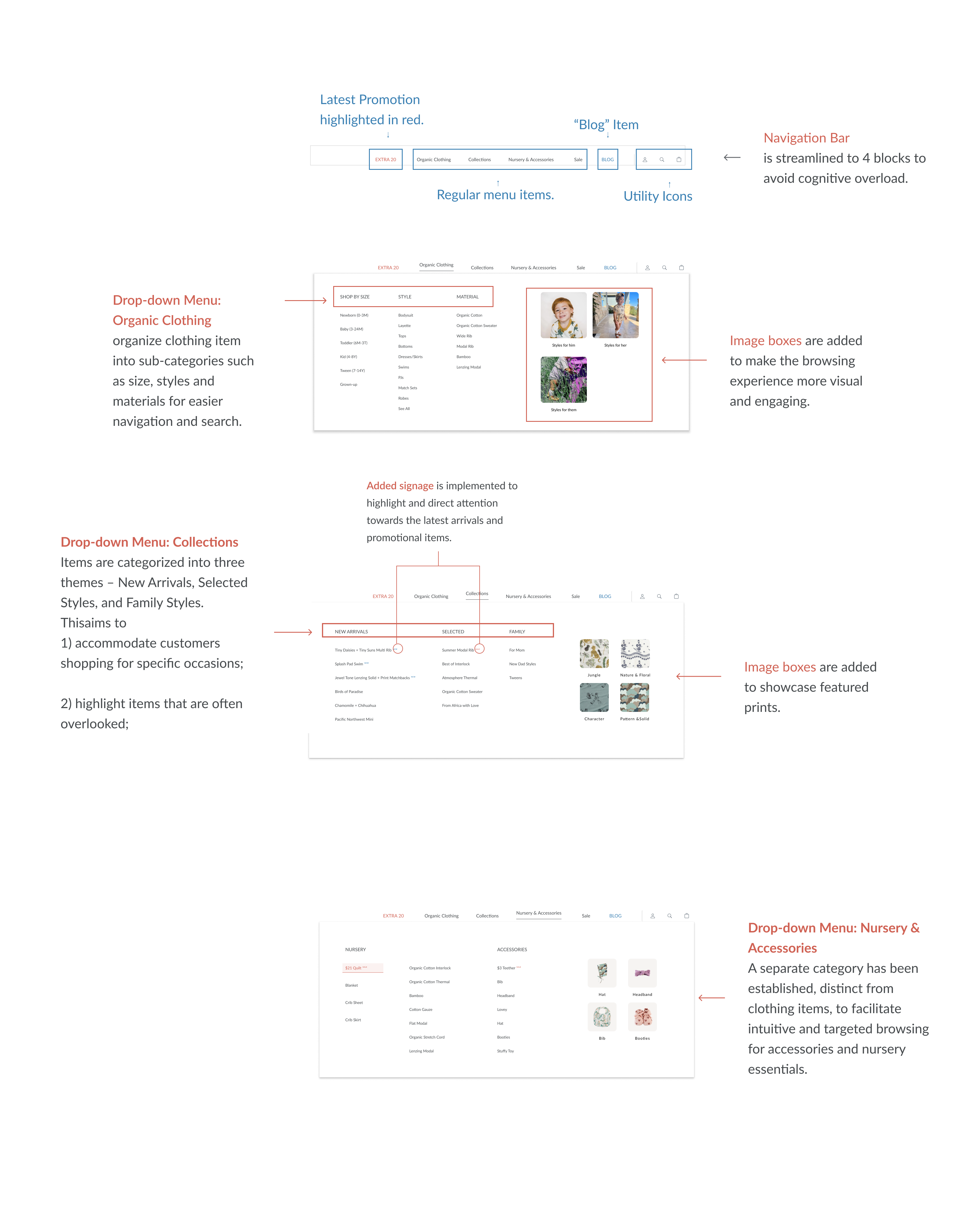
Despite a vast range of products, the website's navigation bar, cluttered with over 15 items, creates cognitive overload and fails to efficiently direct customers to what they're looking for.

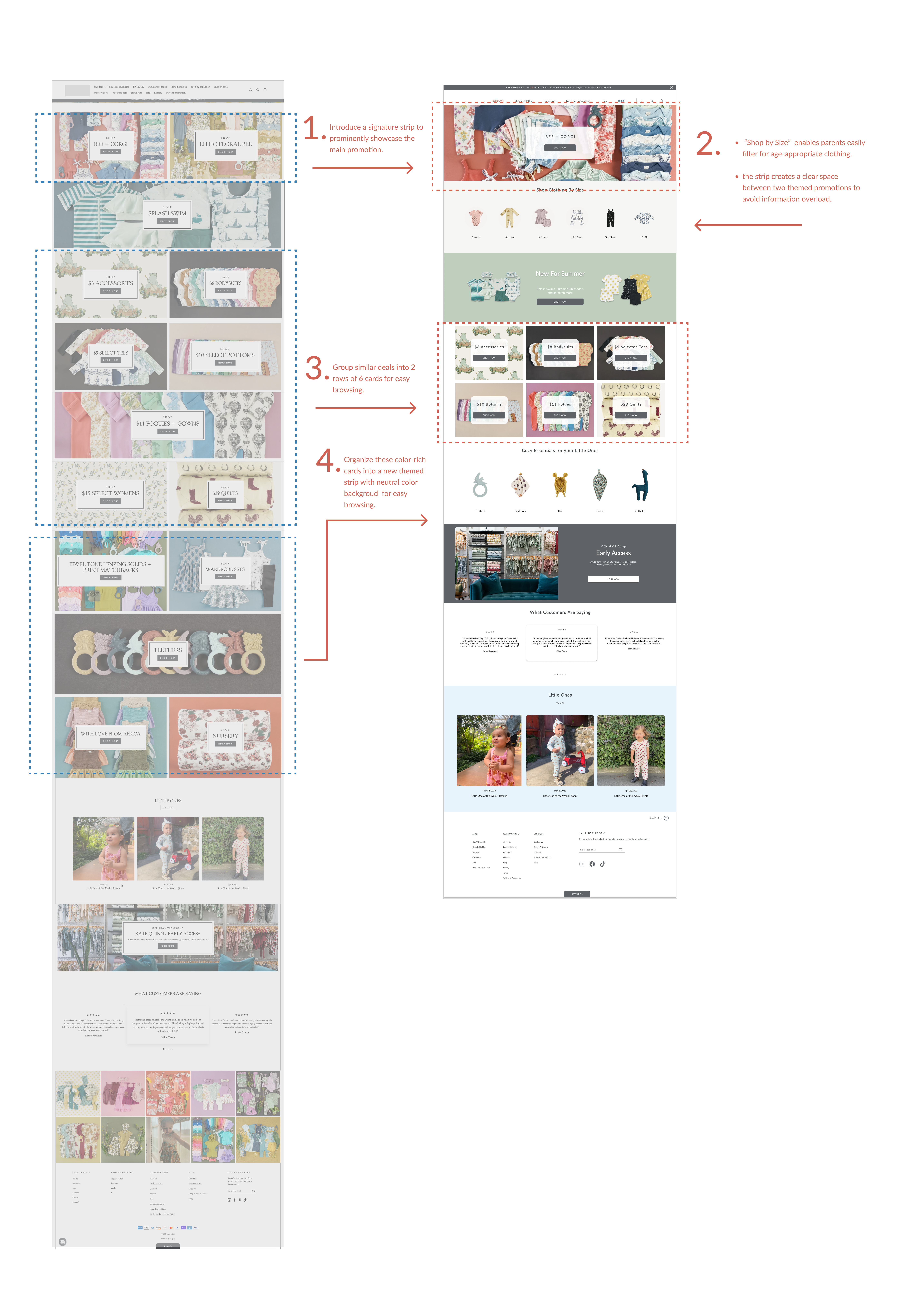
falls short in effectively showcasing promotions or directing customers on where to begin their shopping journey.
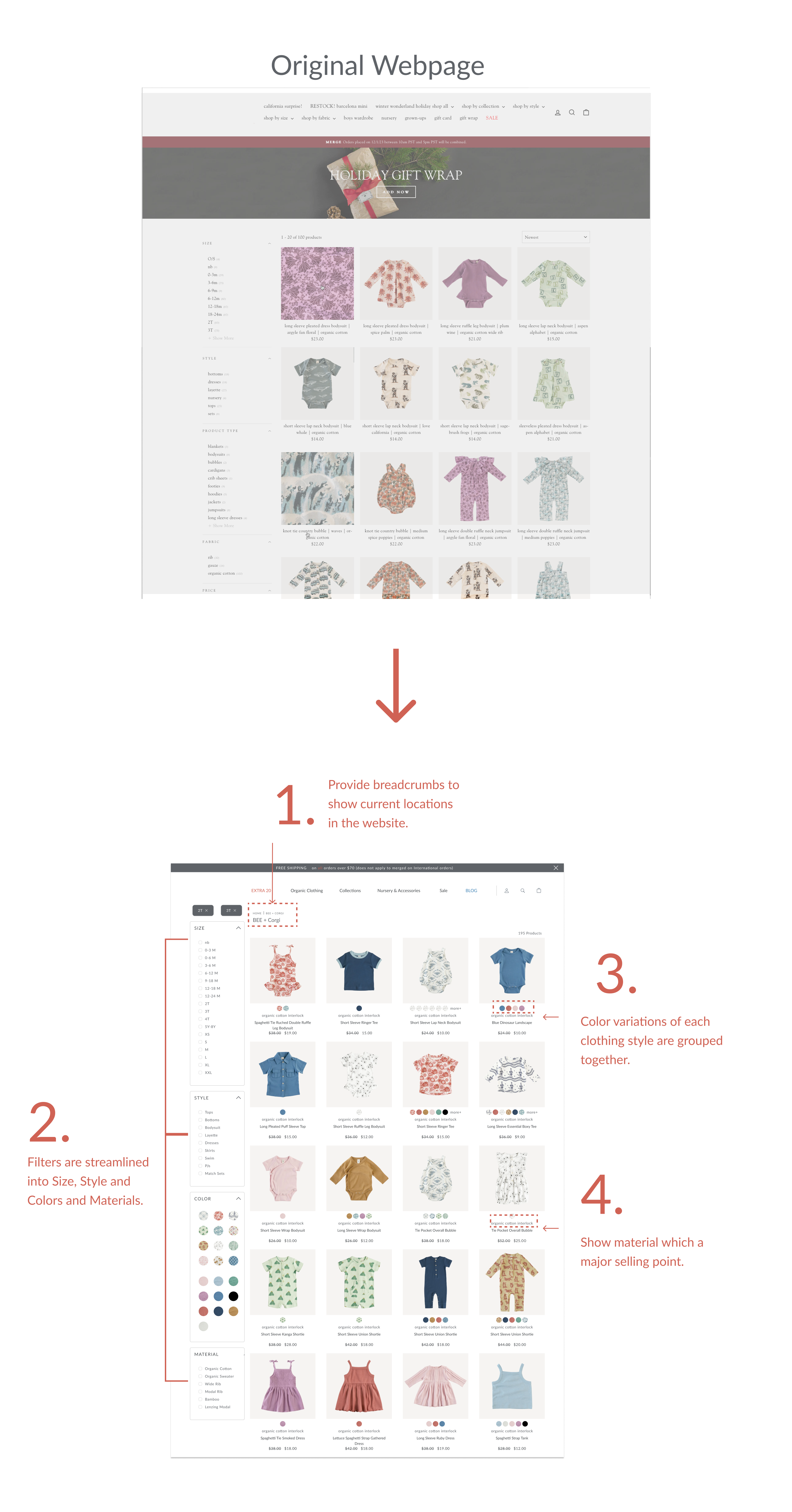
1. Implement breadcrumb navigation
2. Optimize filters.
3 & 4. Highlight selling points
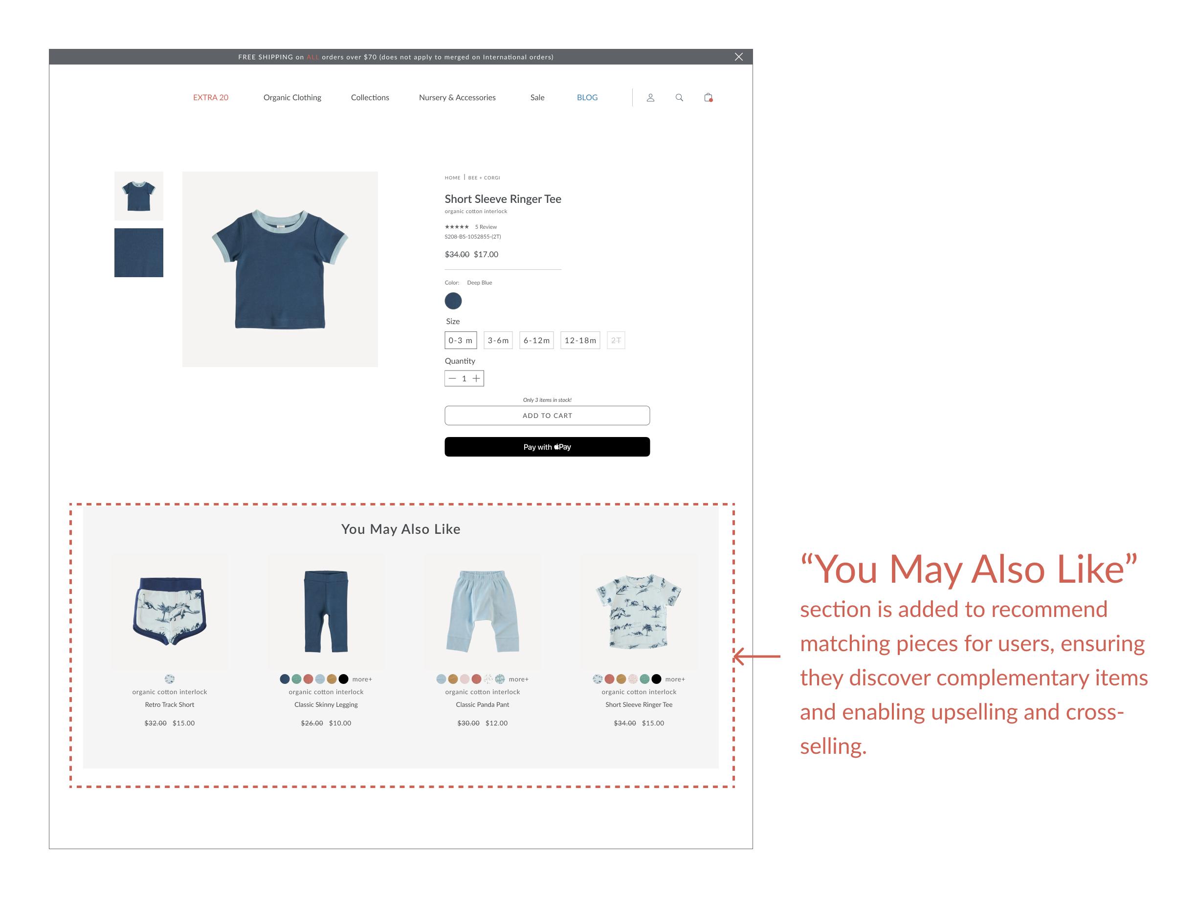
The absence of personalized recommendations not only renders the shopping experience laborious, and prolonged, but it also leads to missed opportunities to effectively upsell and cross-sell products.
Despite a vast range of products, the website's navigation bar, cluttered with over 15 items, creates cognitive overload and fails to efficiently direct customers to what they're looking for.
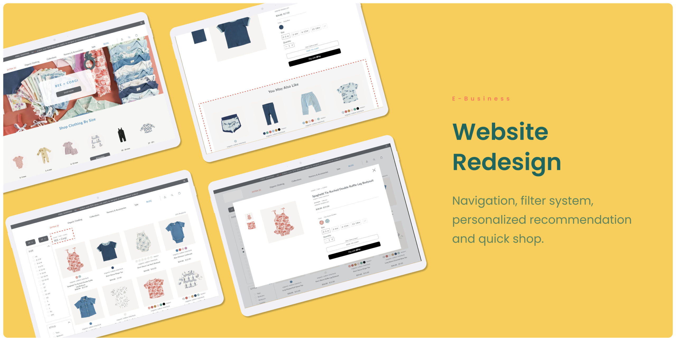
Baby Clothing Website RedesignRedesign
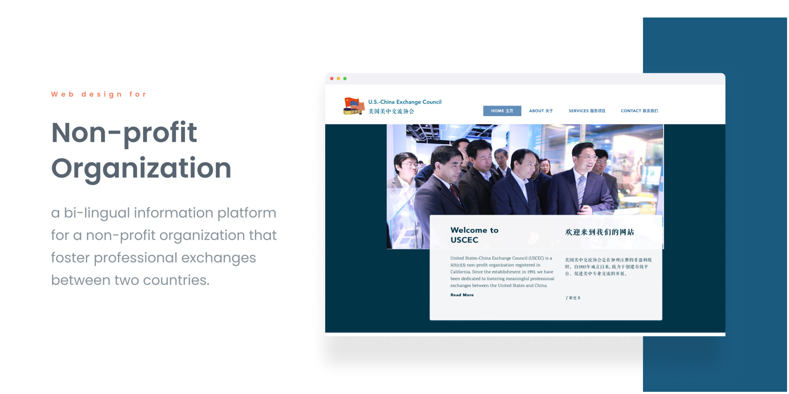
Non-profit Organization WebsiteProject type

Lifeline Chat ExpereiceProject type
© Hanhan C 2023
Ux designer