Hi, this is my first project for the Google UX Design Professional Certificate program.
Han Gallery Audio Tour app provides location-based audio playback and rolling bilingual captions & transcripts for a seamless and effortless experience.
I am the UX designer leading the app design from conception to delivery.
#Figam/Protopie
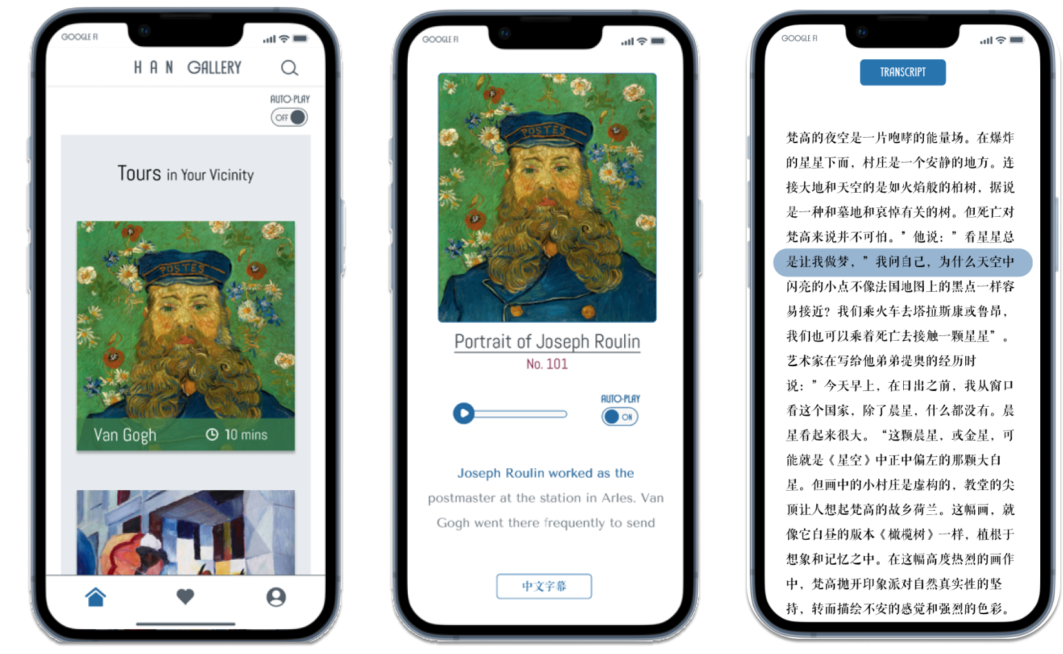
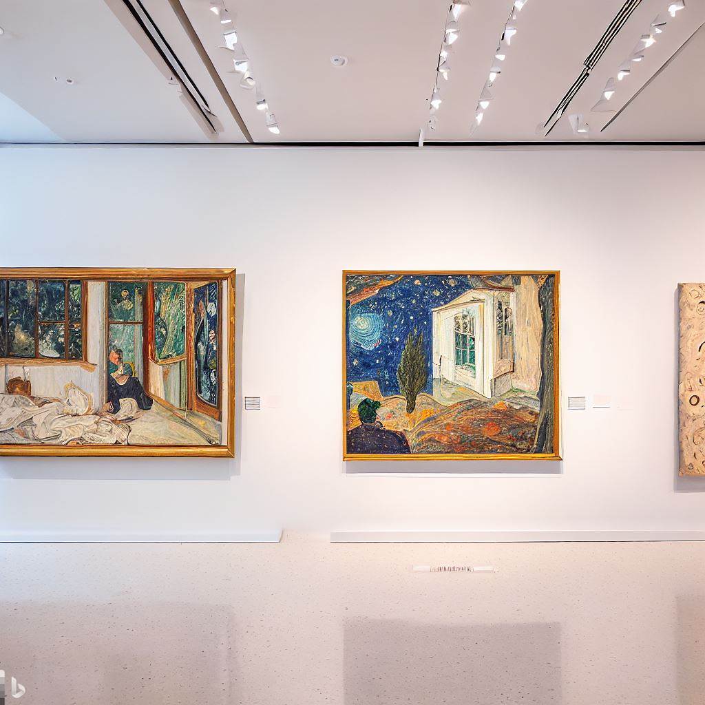
The Imaginary Han Gallery, situated in the vibrant city of San Francisco, features a stunning collection of contemporary artworks.
Han Gallery has taken the initiative to enhance the visitor experience by creating more than 100 audio stops.
However, the current audio-tour device provided to visitors is outdated, cumbersome, and challenging to use, which may detract from the overall experience.
Han Gallery is seeking to develop a mobile app that provides a seamless and intuitive audio-tour experience, increasing visitor engagement, satisfaction, and loyalty.
This is expected to promote positive word-of-mouth recommendations and increase membership by 50%.
I interviewed 4 potential users of the Han Gallery audio guide app via messaging, email, and in-person interaction.
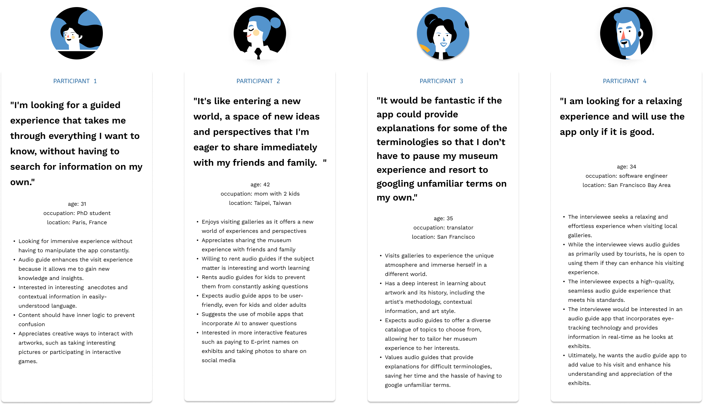

After grouping and analyzing the results, I arrived at 4 conclusions.
1. users are more likely to continue using an audio-guide app if it provides them with personalized information based on their interests and allows them to have control over the content they hear.
2. users seek creative and innovative ways to interact with artworks in order to establish meaningful connections with them.
3. users share their experiences on social media so as be perceived as artistic, fun, and sophisticated.
4. users expect an effortless and intuitive app experience.
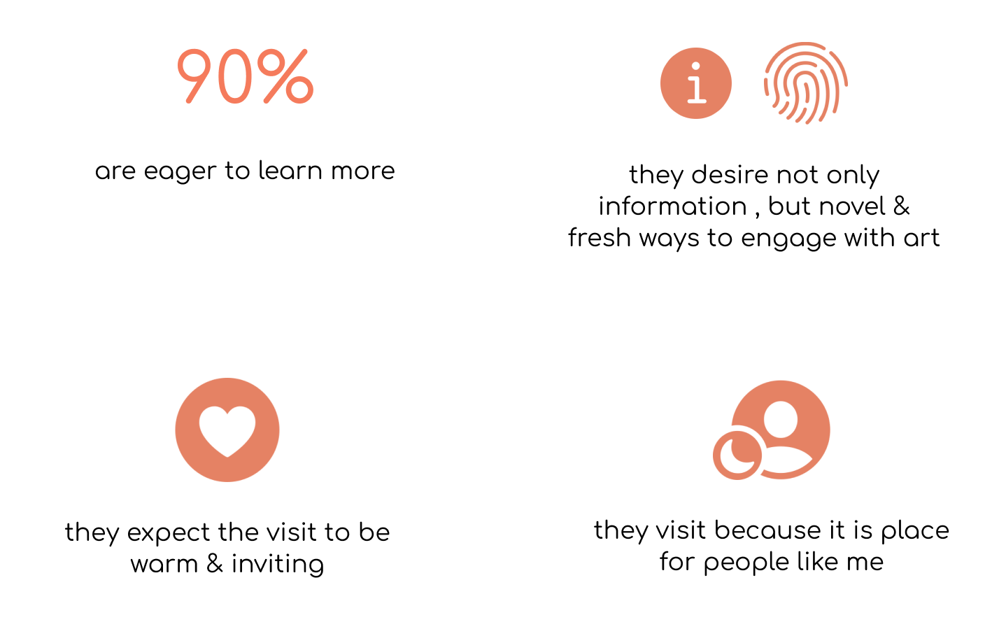
San Francisco Museum of Modern Art (SFMOMA) conducted market research on its visitors in 2013 that engaged 615 Bay area residents, and revealed interesting findings.
SFMOMA also created 2 targeted personas: 1. the fact-finder who craves new information, ideas, and people behind the pieces. 2. the self-improver who aspires to engage with art and to warm spaces that encourage learning.
This research supports my previous conclusions:
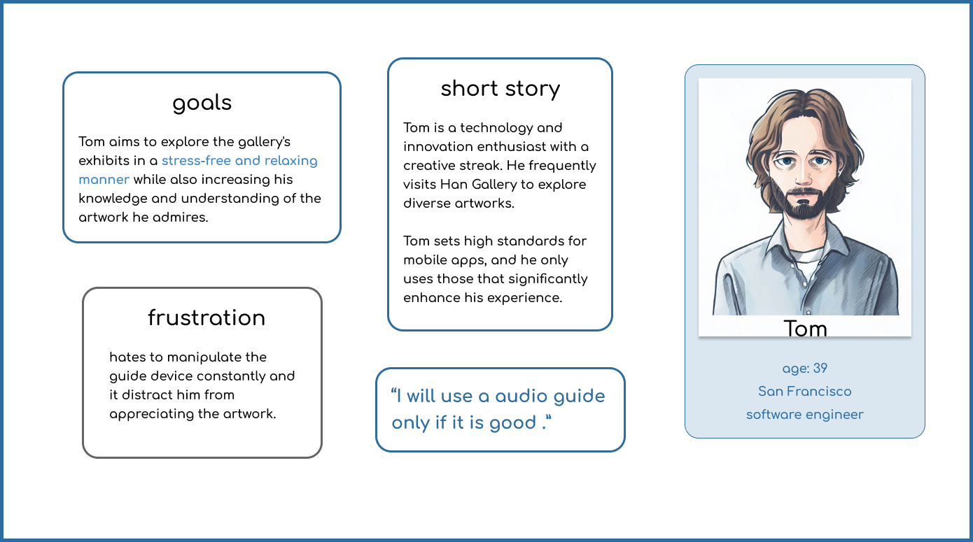
I created two personas that I will design solutions for Lily the learner and Tom the tech-savvy explorer.
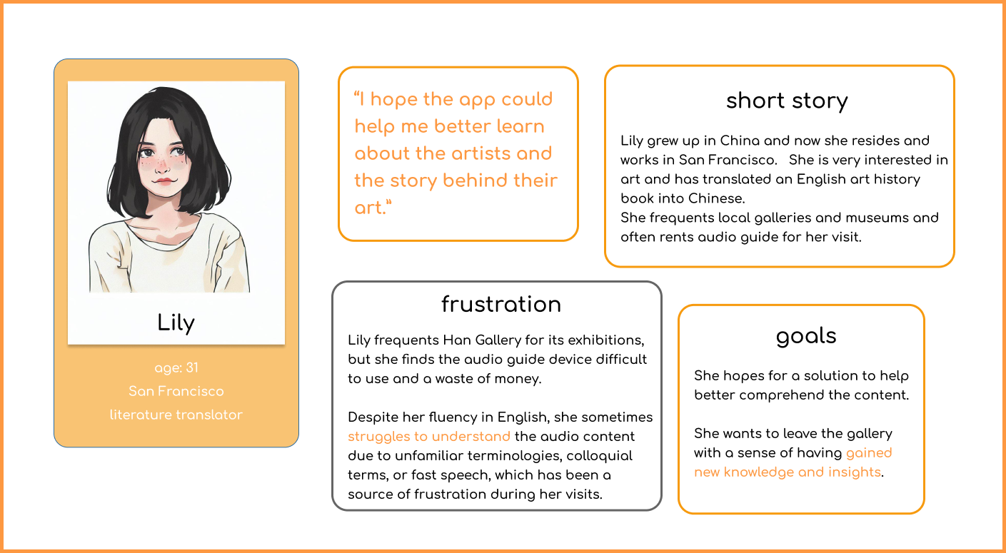
1. How might we assist Lily in overcoming barriers that impede her understanding of the artwork, allowing her to gain a deeper appreciation of the exhibits?
2. How might we assist Tom in effortlessly learning about the artwork, allowing him to experience the gallery exhibits in a stress-free and relaxing manner?
1. create a location-aware app that offers automatic audio playback according to the user's positions in the gallery.
2. Provides bilingual transcripts of the audio contents.
version 1: digital wireframes & hi-di prototypes

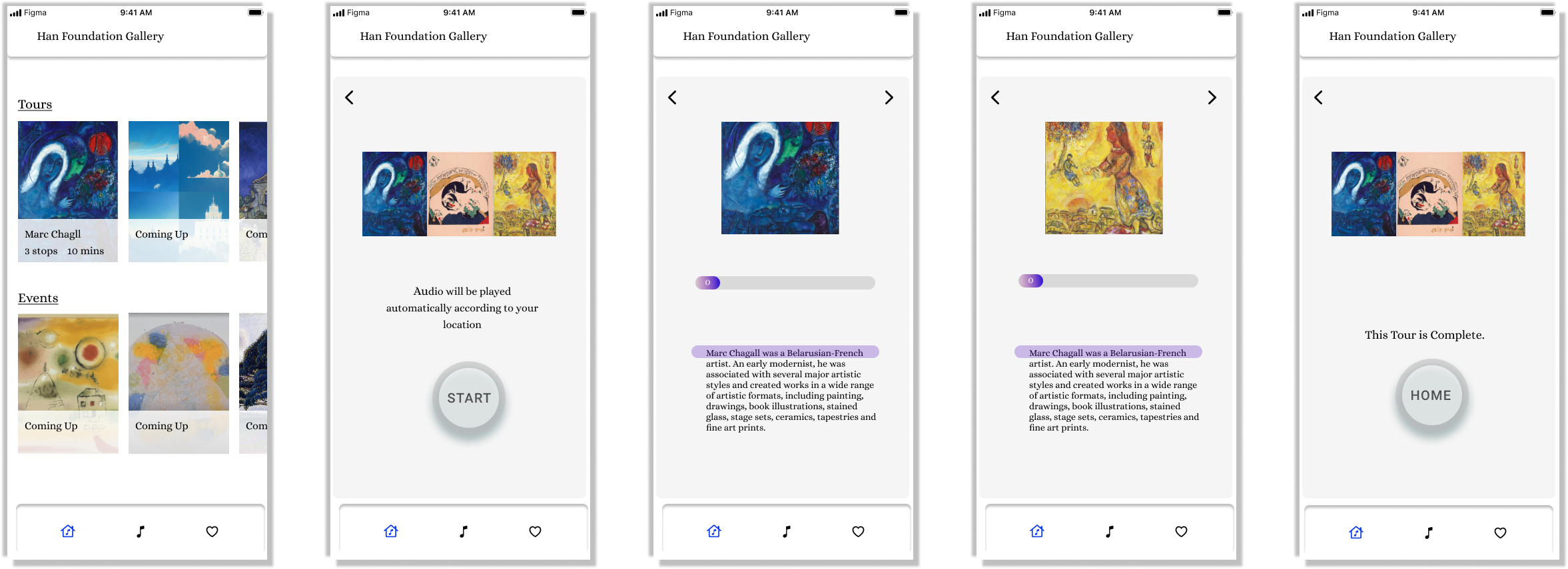
mockup & usability studies findings

I conducted user testing on the mockup with 5 participants and the results reveal several areas for improvement in the design.
1. while the progression bar prioritized a clean and minimalist look, 60% of users found it difficult to use without the traditional play/pause button.
-- It is important to balance aesthetics with functionality and consider adding a traditional play/pause button to the progression bar design.
2. users found the navigation icons too small, which made it difficult for them to locate the "back" and "next" buttons.
--It is recommended to increase the size of navigation icons to make them more visible and easier to use.
3. the design of the "Home" button was considered unusual by users, which may have contributed to their difficulty in using it.
-- Improve the design of the "Home" button to make it more intuitive and user-friendly.
Version 2: high-fi prototypes & usability studies

I conducted the usability studies with 4 participants and it reveals interesting findings:
Version 3: high-fi prototypes & mocups
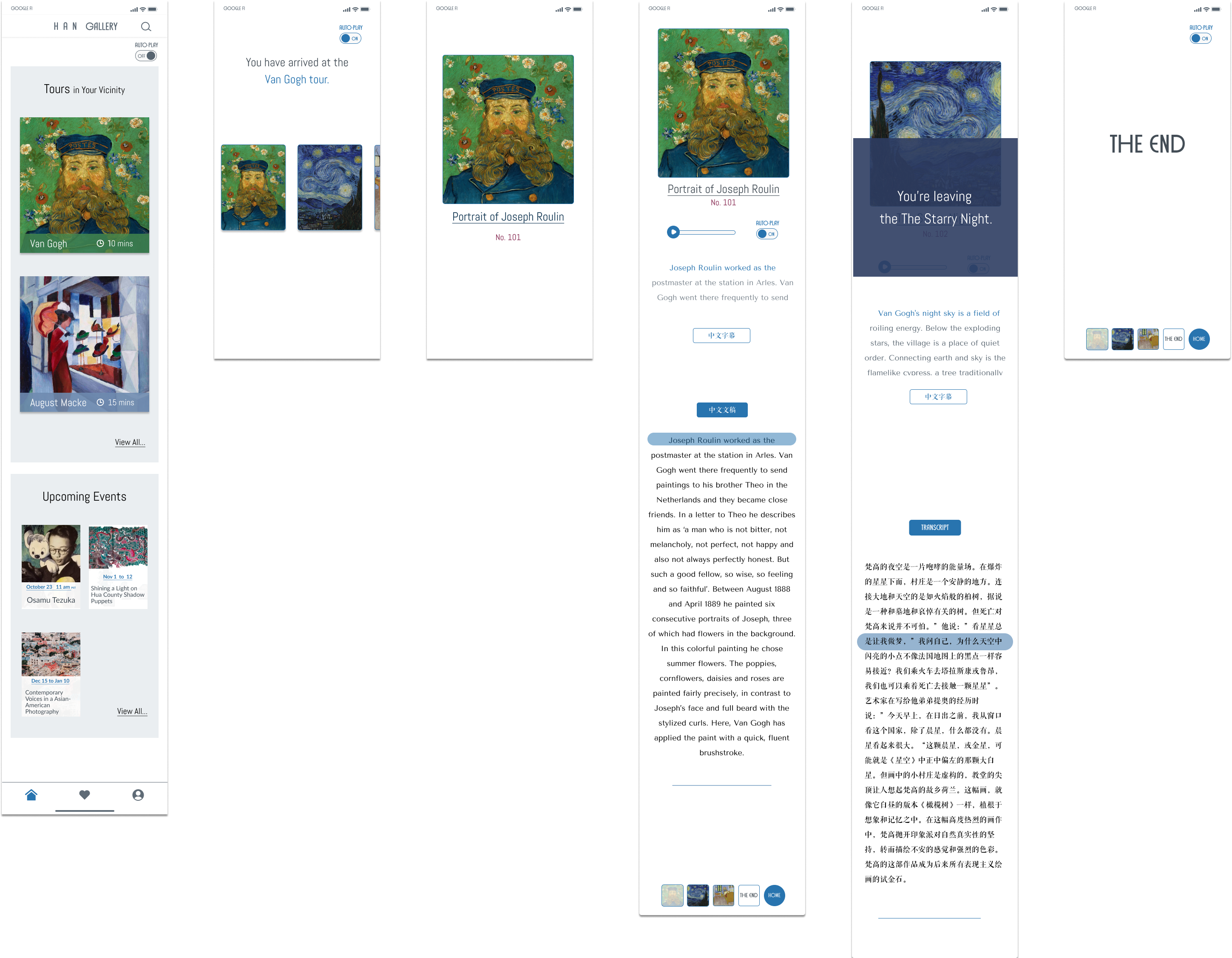
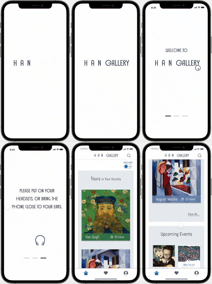
Locoation-aware interfaces design.
the onboarding page introduces users to the location-aware function.
the tour begins automatically upon arrival at the scene.
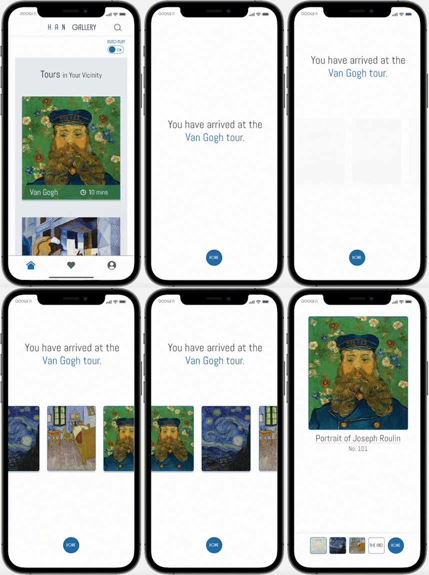
leave mid-way: playback pause and banner appears

Bilingual captions and transcripts design.
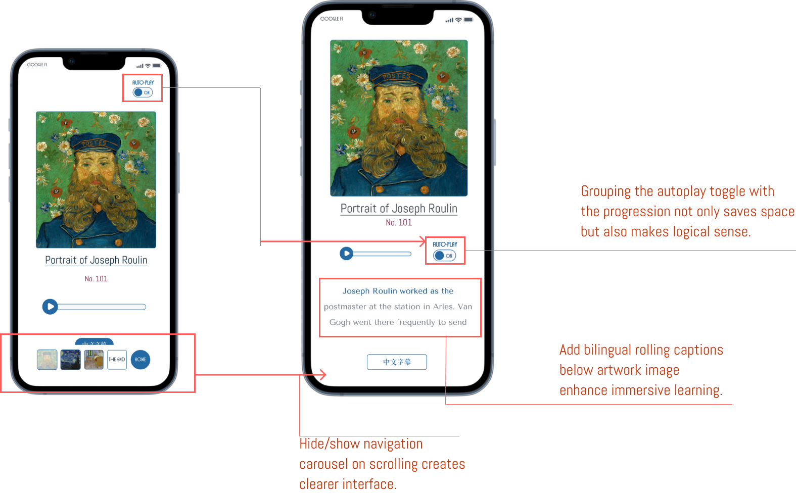
bi-lingual rolling captions are added under the artwork image for a fully immersive learning experience.
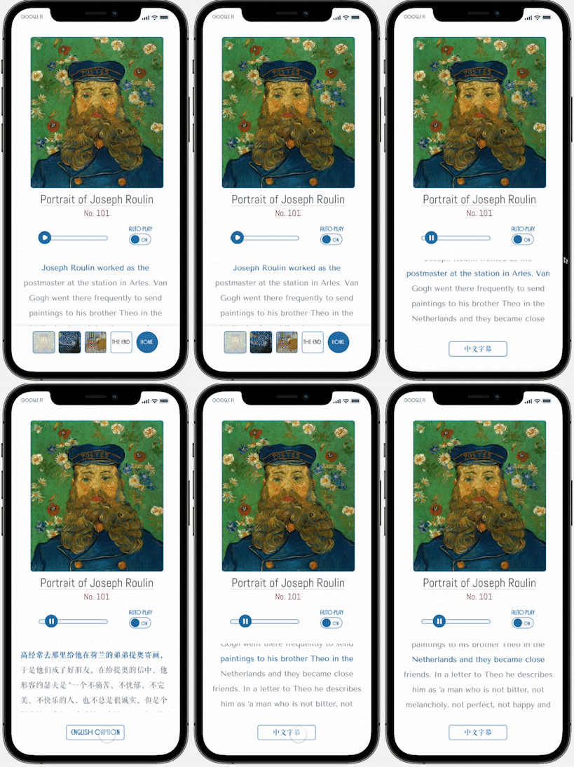
users can access bilingual transcripts on the same page.
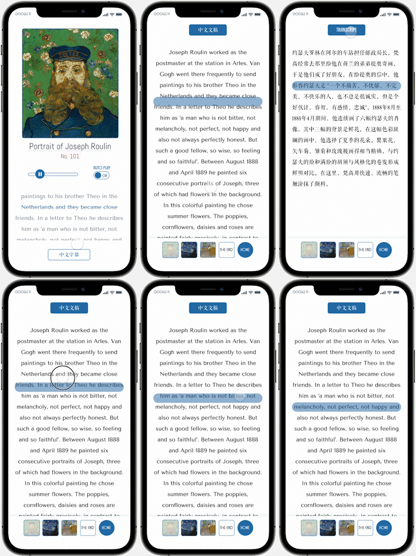
the navigation carousel can be hidden or shown on scrolling to create a clearer interface.

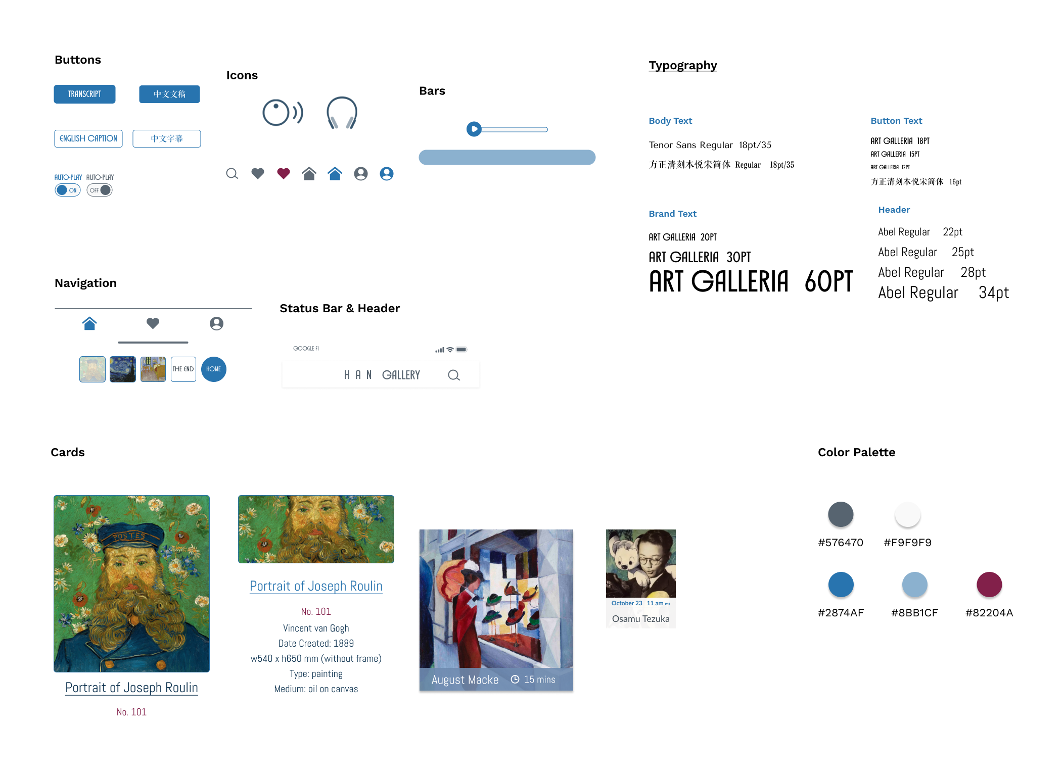
I want to create a modern and minimalistic interface that effectively showcases the artwork and provides an intuitive user experience.
The white background (#F9F9F9) effectively highlights the artwork, while a muted blue-grey is selectively used for icons, logos, and text to create a cohesive and harmonious visual experience.
For the CTA buttons, I selected a shade of blue that gives a sense of reliability and trustworthiness, while the deep burgundy adds a touch of elegance and sophistication to the design.
I selected Art Galleria as the brand font. For the header text, I chose Abel, which is a clean and modern sans-serif font. Finally, for the body text, I selected Tenor Sans, which is a legible font that is easy on the eyes.
*This prototype includes audio effects.
In case you are unable to hear the audio, I recommend trying a different browser or downloading the Protopie Mobile app for the full effect.
Takeaways
Next step
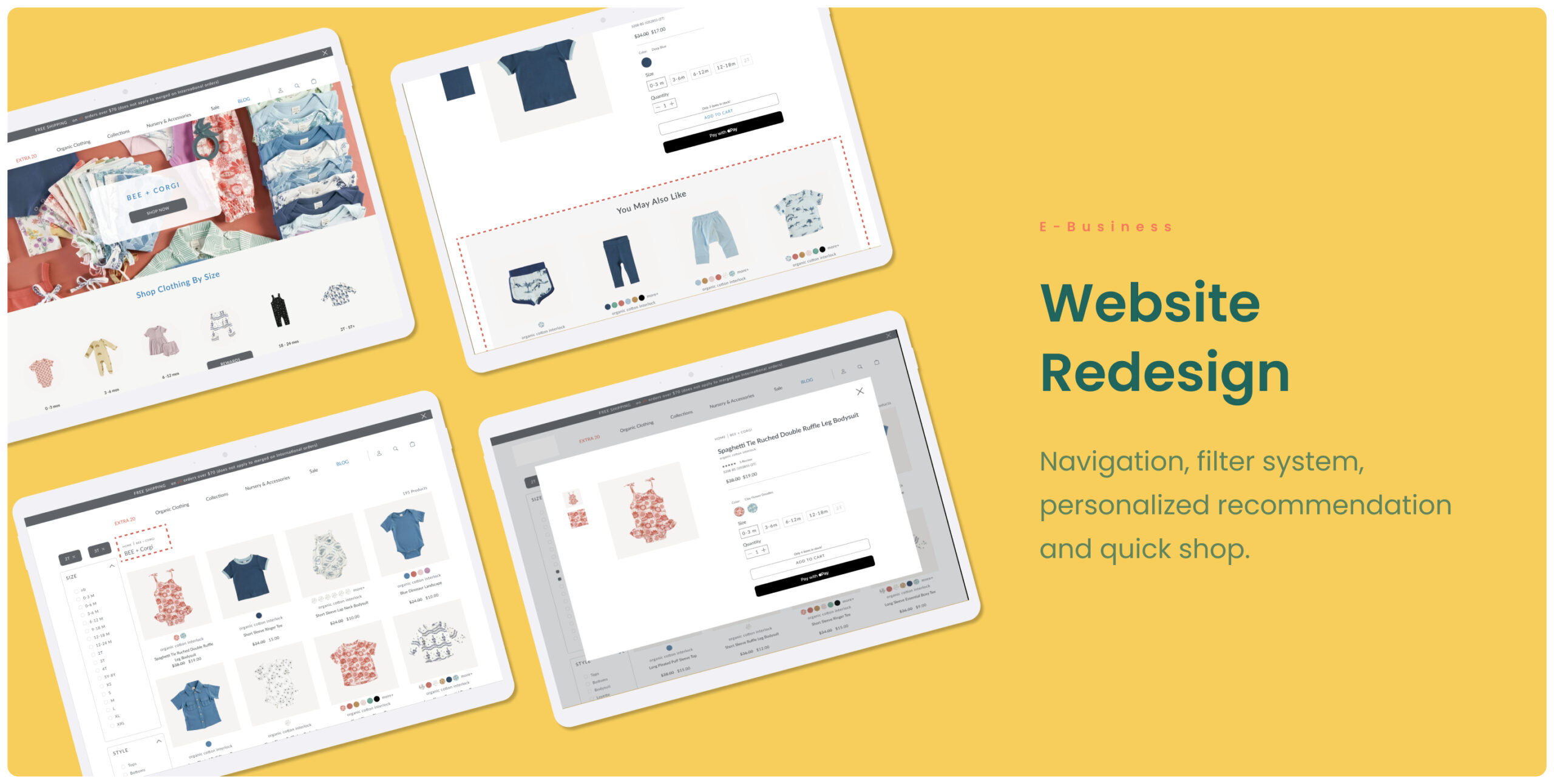
Baby Clothing Website RedesignRedesign
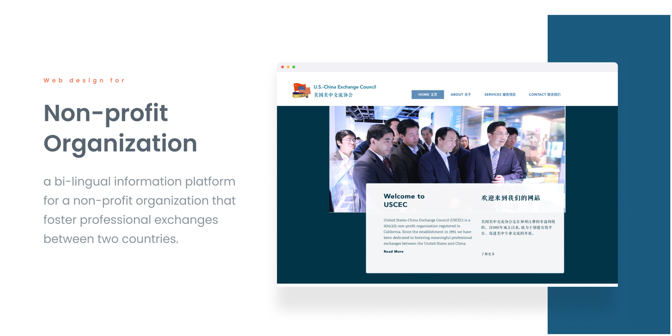
Non-profit Organization WebsiteProject type

Lifeline Chat ExpereiceProject type
© Hanhan C 2023
Ux designer